
Re-design of the mobile app and site for realestate.co.nz
— 2019
Realestate.co.nz, a pivotal entity in New Zealand's property market, underwent a substantial transformation in 2019 with the redesign of its app and website. In a strategic partnership with BCG2, with Kevin Akers, the project unfolded over an immersive eight-month journey. The process was a comprehensive exploration, involving extensive research, discovery, meticulous planning and the final design phase. With a keen eye on every detail, the redesign aimed at enhancing user experience and optimising functionality. The culmination of this collaborative effort resulted in the successful release of a minimum viable product (MVP), marking a significant milestone in the evolution of their digital platforms.
Our process
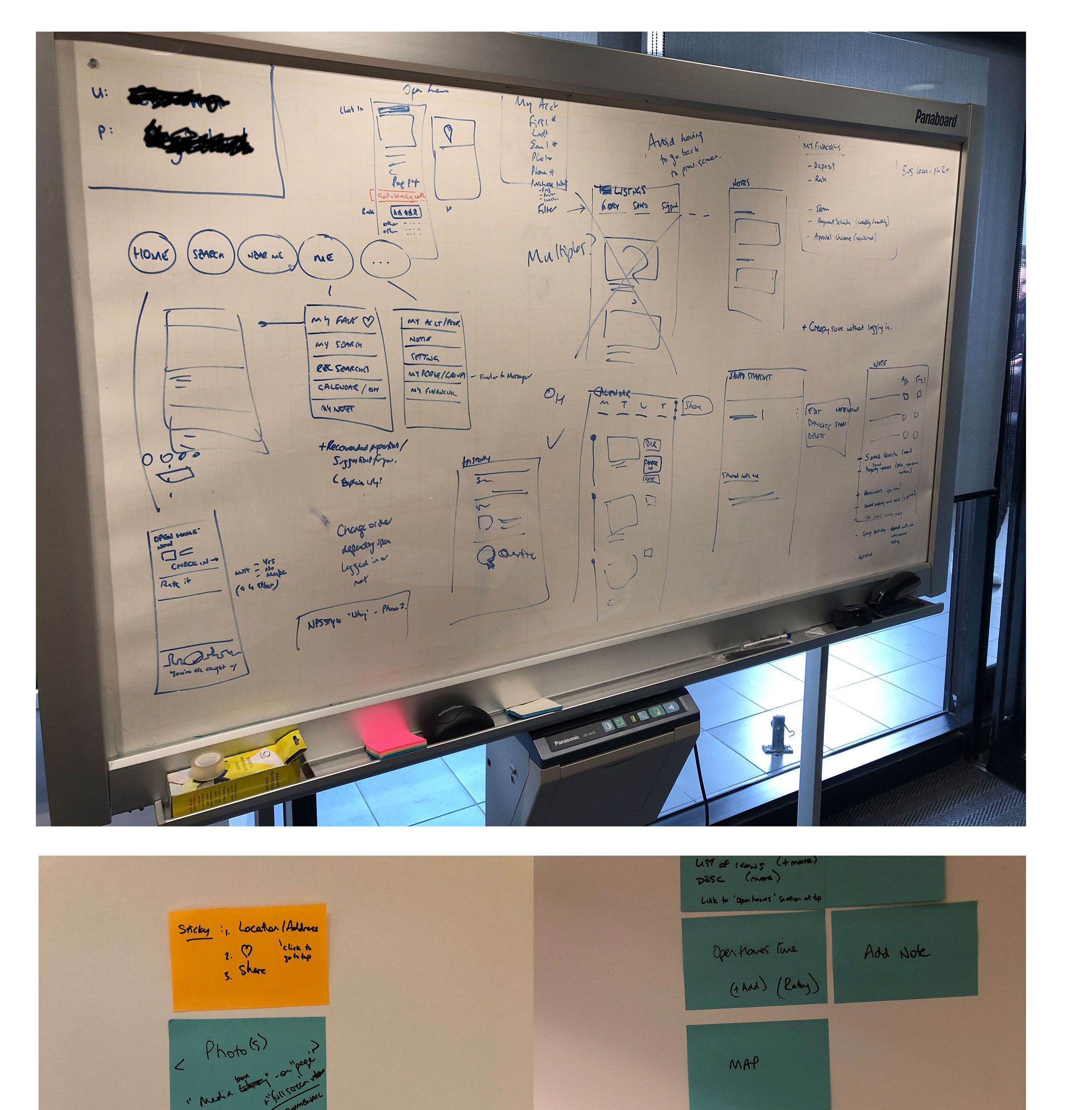
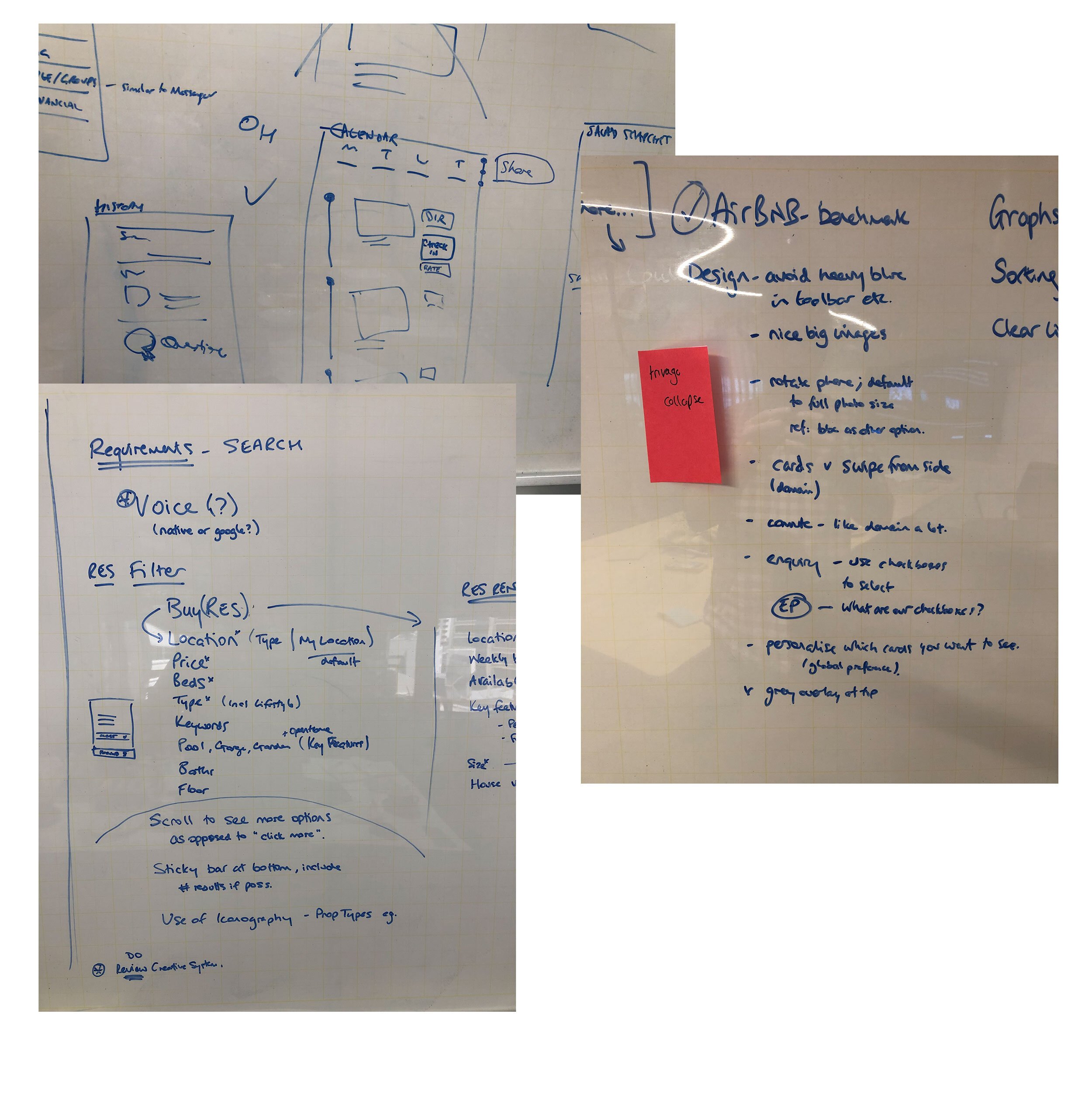
Our process began with extensive discovery and research, combining stakeholder interviews, user journey mapping and behavioural analytics. We reviewed data from search funnels, listing interactions, and enquiry forms to identify points of friction and drop-off. These insights shaped early hypotheses around simplifying navigation, improving property information clarity and making key actions like “Enquire” and “Save” more visible.
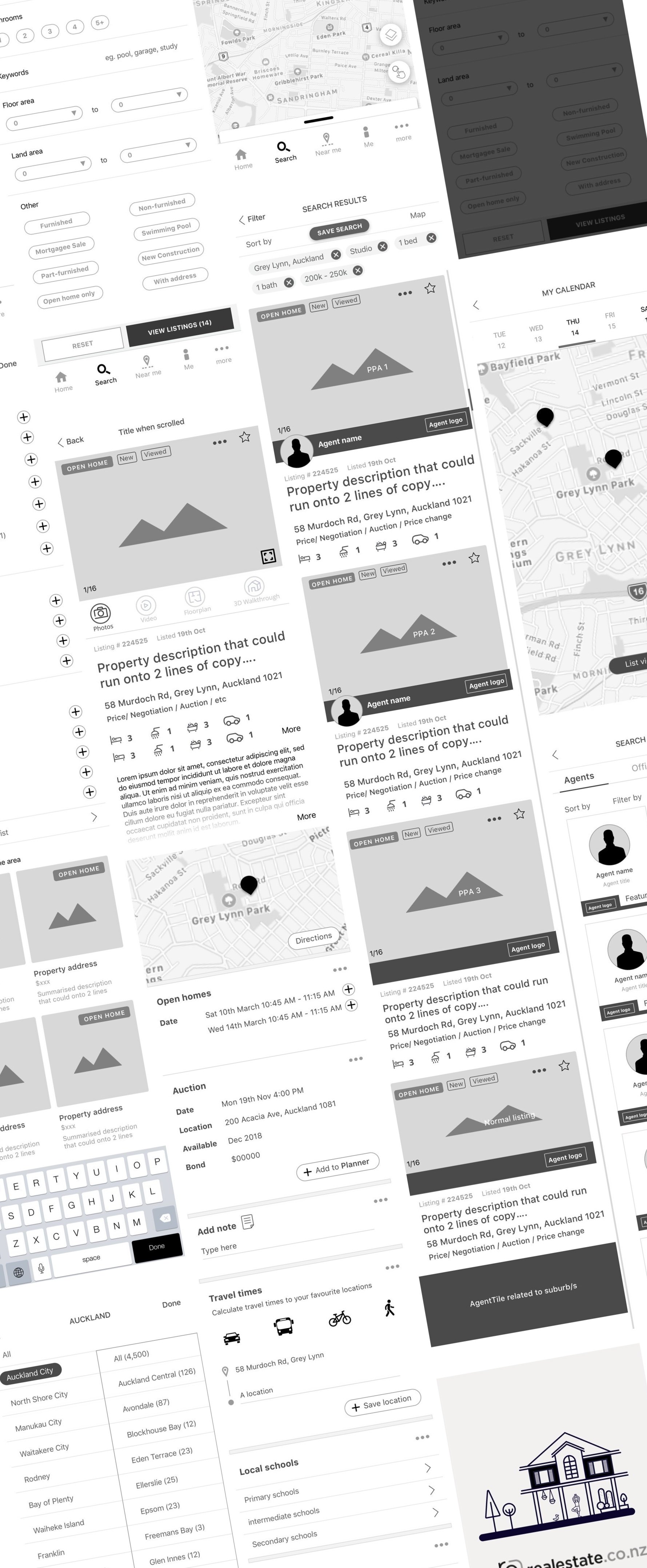
Wireframes and low-fidelity prototypes were developed early to validate flow and content hierarchy. Through iterative user testing, we refined layouts, filter logic and interaction states to remove unnecessary steps and reduce cognitive load. Each iteration was guided by measurable outcomes such as reduced bounce rates and increased click-throughs.
We also introduced a data-led experimentation model, aligning with product owners and analysts to design for A/B testing from the outset. This allowed real-world validation before full rollout, ensuring every design decision contributed to conversion goals.
Throughout the project, cross-functional collaboration was key. Regular design reviews with product stakeholders ensured feasibility and consistency, while maintaining design intent. Accessibility, performance and scalability were considered at every stage, establishing a foundation for continuous improvement beyond launch.

Our delivery
Web site design
Delivery was managed through an Agile workflow, integrating design and development in two-week sprints. As the lead designer, I worked closely with the product owner, developers and analysts to translate insights into actionable design solutions that could be tested and released incrementally.
Design files were structured as a scalable component system establishing a single source of truth for UI elements, spacing, typography and interaction patterns. This system enabled rapid prototyping, reduced rework and improved handoff efficiency. Each sprint included a review cycle where prototypes were shared in design critiques and usability walkthroughs, ensuring alignment and quality before handoff.
Throughout delivery, I maintained open feedback loops with stakeholders and the wider brand and marketing team to ensure visual alignment across campaigns and channels. The approach balanced speed and precision, allowing us to roll out validated improvements while continuing to evolve the experience post-launch.
Quantitative outcomes included measurable lifts in engagement and conversion, while qualitative feedback highlighted clearer navigation, improved visual clarity and an elevated sense of trust and usability. The delivery phase set the groundwork for ongoing experimentation, enabling the product team to continue optimising beyond MVP release.


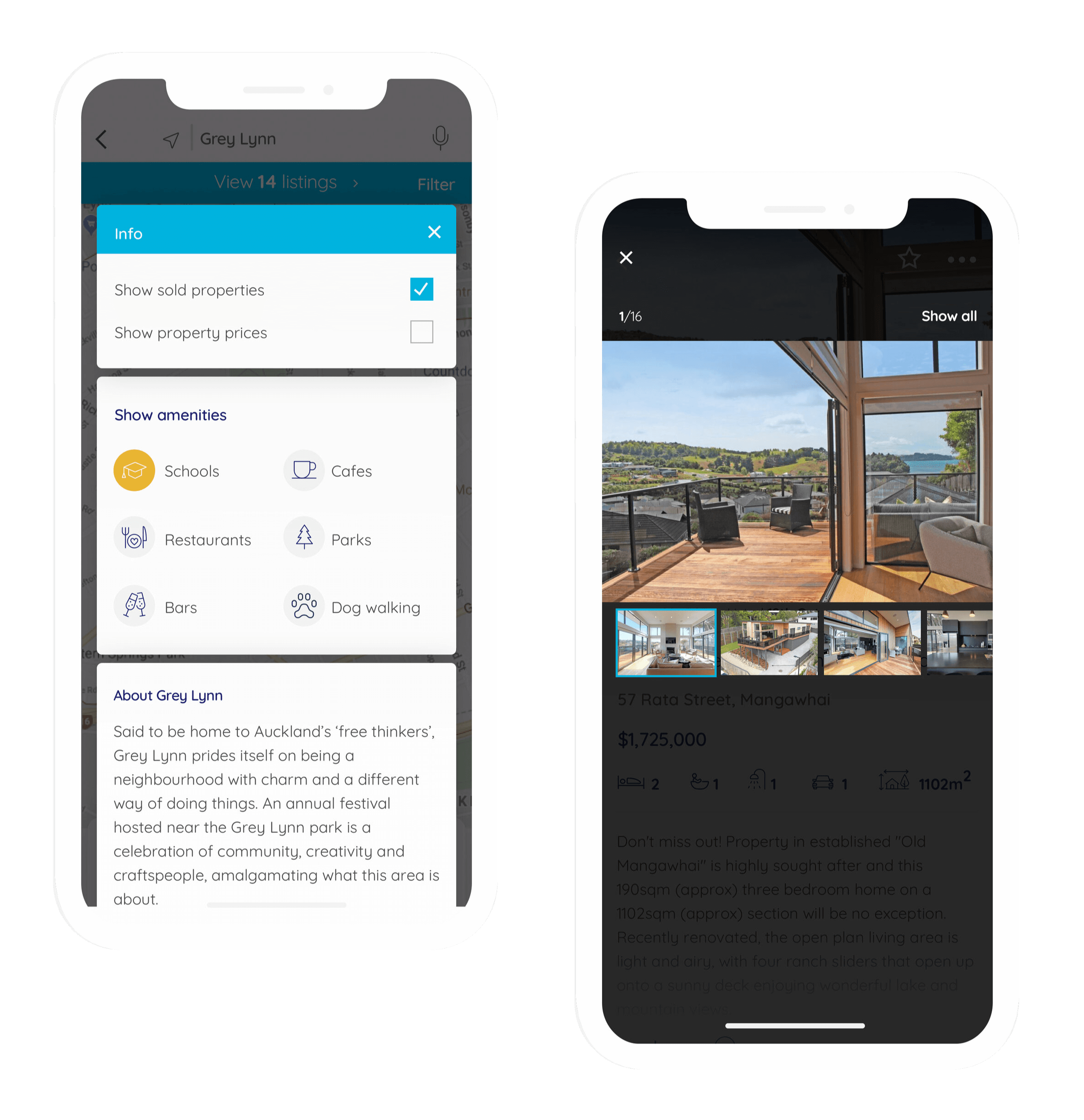
App design
The mobile app redesign was developed alongside the web experience to ensure consistency and continuity across touchpoints. With more than half of all property searches coming from mobile, the goal was to create an experience that felt natural, fast and responsive in context.
Early research involved observing how people searched and enquired about properties while on the go. Insights showed users wanted faster filtering, more visual discovery and fewer steps between viewing and contacting an agent. These findings shaped a complete rework of the navigation and interaction model.
The new app introduced a cleaner card-based design language optimised for thumb reach and quick scanning. Persistent filters and map-based browsing gave users flexibility in how they explored listings while simplified enquiry flows reduced friction at key decision points.
High-fidelity prototypes were tested on both iOS and Android devices to refine gestures, transitions and overall responsiveness. Motion and micro-interactions were added carefully to improve orientation and feedback without distraction.
The result was a more intuitive and cohesive mobile experience that matched the ambition of the brand, modern and built around the needs of users in motion.